The vision: Reimagining Channel 4
Role: Lead Product Designer (TV Specialist)
Focus: Experience Strategy, UI Design, Motion Design, Prototyping
The brief - Channel 4 had just launched its bold, quirky Altogether Different rebrand. However, our streaming apps felt static, utilitarian, and disconnected from this new energy. In a team of multi disciplinary designers we were tasked with defining the north star for the future of streaming. My focus was on the Connected TV experience.

The challenge: A sea of sameness
In a saturated market, global competitors have converged on a functional, homogenous sea of sameness. Without a clear identity, our research showed users viewed us as an 'Ambiguous figure' compared to 'Parental pillars' like Netflix.
The goal - Translate the daring, mischievous Altogether Different masterbrand into a digital product relevant for the next 3-5 years. This north star vision would later steer our Request for Proposal, to select a new technology partner capable of delivering our distinct ambition.


The strategy: Weaving in distinction
Through a series of cross-functional sprint cycles, we explored how a masterbrand toolkit, originally designed for linear TV, could be reimagined for digital products.
My strategy was grounded in the Brand Triangle, ensuring every decision aligned with our core ambition: to create a destination valued for its unique voice, rather than just another utility content library.
Leveraging my expertise in Connected TV experiences, I explored how to weave in distinction without breaking established norms of TV usability. I explored how linear assets, like on-air interstitials, tone of voice, and static endboards, could be transformed into functional UI components.
To validate this strategy, I led the design of high fidelity motion prototypes, codifying our vision into four experience principles. These were then tested and proven through research and live experimentation.
1. Lead the way
The concept - Channel 4 is a pioneering force. Utilising our brand assets, tone of voice and motion we guide users through immersive and interconnected digital spaces.
The execution - The Channel 4 logo is the navigator, always leading the viewer. Whether scrolling a rail or transitioning between pages, the 4 physically pulls the interface forward while content slices snap into position alongside it.


2. Feel familiar yet distinct
The concept - We embraced the patterns users know and love to ensure an effortless experience, whilst finding opportunities to remain Distinctly 4.
The execution - I took the standard horizontal content rail and injected the brand’s gradient colours into the background. This isn't just decoration, it’s a signal of ownership. The vibrant gradient highlights when a collection is curated by a real human at Channel 4, instantly distinguishing our editorial voice from the algorithms.
3. Be engaging and discoverable
The concept - Content is at the heart of everything we do. We strive to create an engaging user experience that also prioritises and elevates discovery.
The execution - I focused on increasing the likelihood of serendipitous discovery, designing an end of playback experience where the interface anticipates the user's desire for more. See below for how this principle was validated through research and live experimentation.


4. Be worth it
The concept - We continuously strive to exceed user expectations while maximising the platform's potential for revenue generation.
The execution - This was about boldly promoting Channel 4+ (our ad-free tier) without blocking the primary user task. The video demonstrates a premium integration that sits naturally within the content hierarchy, visible enough to drive conversion, but passive enough to respect the free user.
Putting it to the test
While the vision established the direction, one principle demanded deeper proof. 'Be Engaging and Discoverable' raised a specific design challenge: how do you keep a viewer watching when their episode ends? I initiated some research to find out.
The opportunity
The end of playback moment is where viewers make an active decision to watch something else, or leave. The existing experience relied on a passive rail of content and a generic prompt, placing the burden of discovery entirely on the user. I saw an opportunity to rethink this moment end to end, and expanded the scope beyond a single screen to consider the full arc of before, during, and after playback.

The research
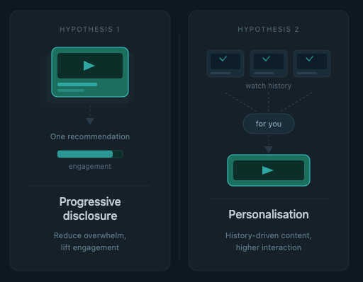
I led unmoderated user testing via Maze with UK participants aged 18–65, testing two competing design hypotheses.
Hypothesis 1 - Progressive disclosure: presenting one focused recommendation would reduce overwhelm and increase engagement.
Hypothesis 2 - Personalisation: surfacing content based on watch history would drive higher interaction.
The most significant finding challenged both. The real barrier to engagement was trust and relevance. Users needed to understand why a show was being recommended, not just see it. A title and thumbnail alone wasn't enough to make a decision.
The design
The concept - Rather than showing a generic rail, I introduced a contextual side panel that appears at the precise moment a viewer has no next episode available. The panel leads with a single, confident recommendation, combining algorithmic personalisation with Channel 4's editorial voice. The rationale for the recommendation is always visible.
The execution - Every design decision mapped back to a principle. The panel simplifies where possible with a single focused recommendation, not a wall of choice. It feels familiar yet distinct by borrowing the bright, colourful interstitial format from Channel 4's linear TV experience and translating it into a digital interaction. And it keeps discovery alive with "More like this" always accessible for users who want to browse further.
